How to Choose Paint Colours for Your Home (Without the Overwhelm)
Standing in the paint aisle with fifty shades of "greige" in your hand is one of the most paralysing moments in decorating a home. The good news? Choosing a colour you'll love isn't about a lucky guess. It's about a few simple steps designers follow every single time.
Paint is the cheapest way to transform a room — and the easiest thing to get wrong. Here's how to get it right the first time, without the second-guessing (or the expensive mistakes).
Start with the feeling, not the colour
Before you look at a single swatch, ask how you want the room to feel. Calm and restful? Warm and cosy? Bright and fresh? Elegant and quiet? The feeling comes first, and the colour follows it — not the other way around.
A bedroom you want to feel restful leans toward soft, muted tones. A living room you want to feel warm reaches for earthy creams, clays and warm neutrals. Naming the feeling narrows fifty options down to five.
Let the light decide
The same colour looks like three different colours depending on the light in your room. This is the step most people skip — and the reason so many walls end up looking cold, grey or "off."
- South-facing rooms (in the Southern Hemisphere) get cooler, indirect light — warm your palette up to balance it.
- North-facing rooms get warm, golden light for most of the day — you can happily go cooler or more neutral here.
- Always test in the actual room, at morning, midday and evening. A colour that's perfect at 9am can turn muddy by dusk.
Test big, test on the wall
A tiny chip from the store is not enough to commit to. Paint a large patch — at least A4 size, ideally bigger — directly onto the wall, or onto a board you can move around the room. Live with it for a day or two.
Build a palette, not a single colour
A room rarely needs just one colour — it needs a small, considered family of them. A simple, foolproof formula:
- A main wall colour — usually your calm, neutral base.
- A trim and ceiling tone — often a soft off-white, a shade lighter than the walls.
- One or two accent colours — brought in through cushions, art and décor, not necessarily paint.
Three to five colours that talk to each other will always feel more considered than one bold choice standing on its own.
Work with what you're keeping
Your walls don't exist in a vacuum. Look at your flooring, your big furniture, the pieces you're not replacing — and choose colours that flatter them. The most beautiful palette in the world falls flat if it fights the couch you already own.
When in doubt, go warmer and softer
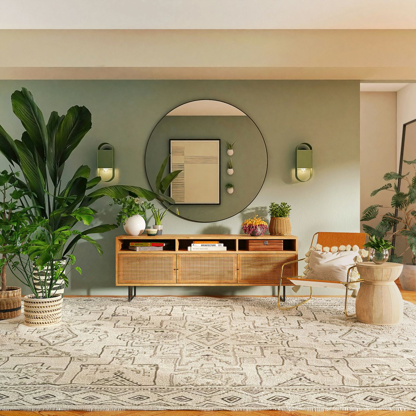
If you're truly torn, err on the side of warm and muted rather than cool and stark. Warm neutrals — creamy whites, gentle sages, soft clays and earthy taupes — are forgiving, timeless, and make a home feel like somewhere you want to linger. Trends come and go; warmth never dates.
And remember: paint is not permanent. Choosing colour should be exciting, not stressful. Get the feeling and the light right, test properly, and let your home tell you what it wants.
Not sure where to start?
A Colour Consultation gives you a curated palette with exact paint codes — chosen for your room, your light and your style, ready to take straight to the store.
Book a Colour Consultation